Reduce next/image bandwidth usage
This example shows how to reduce bandwidth and processing costs when using different layouts.
Using layout="fill" or layout="responsive"
Using layout=fill in next/image is one of the most common patterns as it let us use responsive parents and (along with the objectFit prop) our images will resize to it perfectly. But this leads to a common problem; as we don't know how large our parent might be, we can't serve an optimized image.
For example, the following card has an image with layout=fill:

And is represented by this code:
<Card>
  <Image layout="fill" src="..." />
</Card>
Everything looks okay but our image has a width of 256px and we are serving a 1000px image!
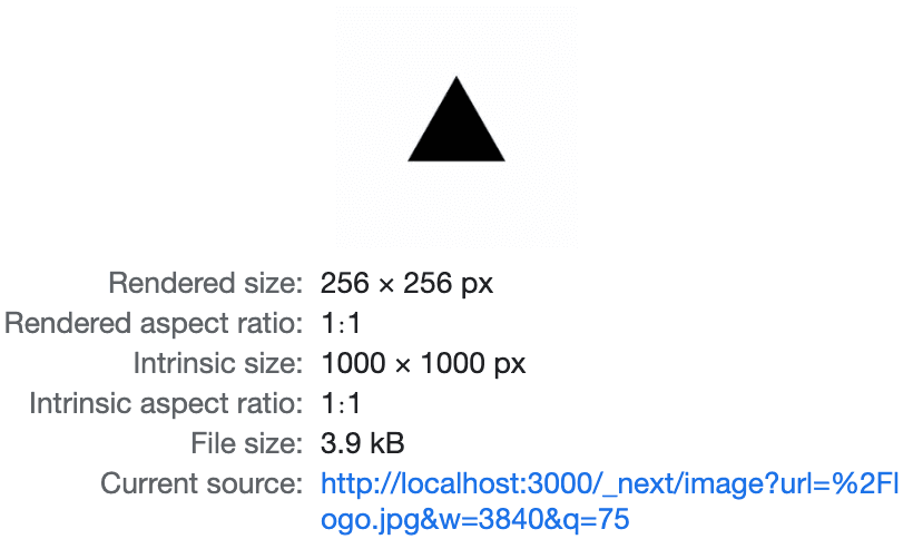
To serve optimized images we need to use the sizes prop, which provides information about how wide the image will be at different breakpoints when using layout="responsive" or layout="fill". In this case our card limits the width of the image to a maximum of 256px. So if we update our code and set sizes to 256px it should give us a smaller image:

<Card>
  <Image layout="fill" sizes="256px" src="..." />
</Card>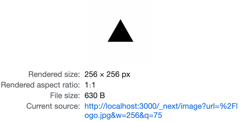
Now we are being served with an optimized image.
We also have a lot of images available for different viewport sizes that will be generated (and cached) on demand just when needed. By default, a variant will be available for every device size configured. But we can also specify image sizes that will be concatenated to the variants generated by device sizes when using layout="responsive" or layout="fill".
Using layout="fixed" or layout="intrinsic"
These layout values require the width and height of the image to be defined. The image will then include the variant that better matches its size and a bigger variant for high DPR screens (more about DPR in the next section).

<Card>
  <Image src="..." width={256} height={256} />
</Card>
Note: intrinsic is the default layout so we don't have to define it.

How the browser decides which variant to use
A variant is one of the image sources (a URL with a descriptor) being added to the srcset attribute, which is one of the things next/image does under the hood. The browser decides what variant to use based on the following factors:
- If the image has
widthandheight, the browser picks thesrcsetthat matches the DPR (Device Pixel Ratio) of the screen, and the descriptor part of thesrcsetindicates the pixel density. - If the image has
sizesset, the browser picks thesrcsetwhose width descriptor matches the width indicated bysizes, and for high DPR screens it will pick a higher size. For example, for a full hd display in a common size (DPR of ~1), our 256w image will use the 256w variant, for a retina display with a DPR of ~2, the browser will pick the 640w variant instead: